Wednesday, September 5, 2018

How We More than Doubled Conversions & Leads for a New ICO [Case Study]

Posted by jkuria

Summary

We helped Repux generate 253% more leads, nearly 100% more token sales and millions of dollars in incremental revenue during their initial coin offering (ICO) by using our CRO expertise.

The optimized site also helped them get meetings with some of the biggest names in the venture capital community — a big feat for a Poland-based team without the pedigree typically required (no MIT, Stanford, Ivy League, Google, Facebook, Amazon, Microsoft background).

The details:

Repux is a marketplace that lets small and medium businesses sell anonymized data to developers. The developers use the data to build “artificially intelligent” apps, which they then sell back to businesses. Business owners and managers use the apps to make better business decisions.

Below is the original page, which linked to a dense whitepaper. We don’t know who decided that an ICO requires a long, dry whitepaper, but this seems to be the norm!

A screenshot of a cell phone Description generated with very high confidence

This page above suffers from several issues:

  • The headline is pretty meaningless (“Decentralized Data & Applications Protocol for SMEs). Remember, as David Ogilvy noted, 90% of the success of an ad (in our case, a landing page) is determined by the headline. Visitors quickly scan the headline and if it doesn’t hold their interest, bounce immediately. With so much content on the web, attention is scarce — the average time spent on a page is a few seconds and the average bounce rate is about 85%.
  • The call to action is “Get Whitelisted,” which is also meaningless. What's in it for me? Why should I want to “Get Whitelisted”?
  • A lack of urgency to act. There is a compelling reason to do so, but it was not being clearly articulated ("Get 50% OFF on the tokens if you buy before a certain date.")
  • Lack of “evidentials”: Evidentials are elements that lend credibility or reduce anxiety and include things like mentions in trusted publications, well-known investors or advisors, industry seals, association affiliations, specific numbers (e.g. 99% Net Promoter Score), and so on.
  • Too much jargon and arcane technical language: Our research using Mouseflow’s on-page feedback feature showed that the non-accredited-investor ICO audience isn’t sophisticated. They typically reside outside of the US and have a limited command of English. Most are younger men (18–35) who made money from speculative activities on the Internet (affiliate marketing, Adsense arbitrage, and of course other crypto-currencies). When we surveyed them, many did not initially understand the concept. In our winning page (below), we dumbed down things a lot!

Below is the new page that produced a 253% gain in leads (email opt-ins). Coupled with the email follow-up sequence shown below, it produced a nearly 100% gain in token sales.

Winning page (above the fold):

Here are few of the elements that we believe made a difference:

  • Much clearer headline (which we improved upon further in a subsequent treatment).
  • Simple explanation of what the company is doing
  • Urgency to buy now — get 50% off on tokens if you buy before the countdown timer expires
  • Solicited and used press mentions
  • Social proof from the Economist; tapping a meme can be powerful as it's always easier to swim downstream than upstream. “Data is the new oil” is a current meme.
More persuasive elements (below the fold):

In the second span (the next screenful below the fold) we added a few more persuasive elements.

For one, we highlighted key Repux accomplishments and included bios of two advisors who are well known in the crypto-community.

Having a working platform was an important differentiator because only one in 10 ICOs had a working product. Most launched with just a whitepaper!

A survey of the token buyers showed that mentioning well-known advisors worked — several respondents said it was the decisive factor in persuading them to buy. Before, the advisors were buried in a little-visited page. We featured them more prominently.

Interestingly, this seemed to cut both ways. One of the non-contributors said he was initially interested because of a certain advisor’s involvement. He later chose not to contribute because he felt this advisor’s other flagship project had been mismanaged!

We also used 3 concrete examples to show how the marketplace functions and how the tokens would be used:

When your product is highly abstract and technical, using concrete examples aids understanding. We also found this to be true when pitching to professional investors. They often asked, “Can you give me an example of how this would work in the real world?”

We like long-form pages because unlike a live selling situation, there's no opportunity for a back-and-forth conversation. The page must therefore overcorrect and address every objection a web visitor might have.

Lastly, we explained why Repux is likely to succeed. We quoted Victor Hugo for good measure, to create an air of inevitability:

How much impact did Victor Hugo have? I don’t know, but the page did much better overall. Our experience shows that radical redesigns (that change many page elements at the same time) produce higher conversion lifts.

Once you attain a large lift, if you like, you can then do isolation testing of specific variables to determine how much each change contributed.

13% lift: Simplified alternate pageThe page below led to a further 13% lift.

The key elements we changed were:

  • Simplified the headline even further: “Repux Monetizes Data from Millions of Small Enterprises.” What was previously the headline is now stated in the bullet points.
  • Added a “5 Reasons Why Repux is Likely to Succeed” section: When you number things, visitors are more likely to engage with the content. They may not read all the text but will at least skim over the numbered sub-headlines to learn what all the points are — just like power abhors a vacuum, the mind can’t seem to stand incompleteness!

We’ve seen this in Mouseflow heatmaps. You can do this test yourself: List a bunch of bullet points versus a numbered list and with a compelling headline: The 7 Reasons Why 20,0000 Doctors Recommend Product X or The 3 Key Things You Need to Know to Make an Informed Decision.

C:\Users\jkuri\AppData\Local\Temp\SNAGHTML26c90c7c.PNG

Follow-up email sequence

We also created a follow-up email sequence for Repux that led to more token sales.

C:\Users\jkuri\AppData\Local\Temp\SNAGHTML4824f99e.PNG

As you can see, the average open rate is north of 40%, and the goal attained (token sales) is above 8%. According to Mailchimp, the average email marketing campaign open rate is about 20%, while the average CTR is about 3%.

We got more sales than most people get clicks. Here’s a link to three sample emails we sent.

Our emails are effective because:

  • They’re educational (versus pure sales pitch). This is also important to avoid “burning out” your list. If all you do is send pitch after pitch, soon you’ll be lucky to get a 1.3% open rate!
  • They employ storytelling. We use a technique known as the “Soap Opera Sequence.” Each email creates anticipation for the next one and also refers to some interesting fact in previous ones. If a person would only have opened one email, they are now likely to want to open future ones as well as look up older ones to “solve the puzzle.” This leads to higher open rates for the entire sequence, and more sales.
  • The calls to action are closer to the bottom, having first built up some value. Counterintuitively, this works better, but you should always test radically different approaches.

Email is a massively underutilized medium. Most businesses are sitting on goldmines (their email list) without realizing it! You can — and should — make at least 2x to 3x as many sales from your email list as you do from direct website sales.

It takes a lot of work to write an effective sequence, but once you do you can run it on autopilot for years, making money hand over fist. As customer acquisition gets ever more competitive and expensive, how well you monetize your list can make the difference between success and failure.

Conclusion

To increase the conversion rate on your website and get more sales, leads, or app downloads, follow these simple steps:

  • Put in the work to understand why the non-converting visitors are leaving and then systematically address their specific objections. This is what “research-driven” optimization means, as opposed to redesign based purely aesthetic appeal or “best practices.”
  • Find out why the converting visitors took the desired action — and then accentuate these things.
  • Capture emails and use a follow-up sequence to educate and tell stories to those who were not convinced by the website. Done correctly, this can produce 2x to 3x as many sales as the website.

Simple, but not easy. It takes diligence and discipline to do these things well. But if you do, you will be richly rewarded!

And if you’d like to learn more about conversion rate optimization or review additional case studies, we encourage you to take our free course.

Thanks to Jon Powell, Hayk Saakian, Vlad Mkrtumyan, and Nick Jordan for reading drafts of this post.


Sign up for The Moz Top 10, a semimonthly mailer updating you on the top ten hottest pieces of SEO news, tips, and rad links uncovered by the Moz team. Think of it as your exclusive digest of stuff you don't have time to hunt down but want to read!

Tuesday, September 4, 2018

5 Ways to Make Your Email More Awesome

make email more awesome

Email marketing hasn’t changed much in the past 20 years.

That being said, tremendous opportunities still exist to improve your results.

Last month, Jay Baer presented a webinar with Rachel Insler, Patina Restaurant Group’s Director of Marketing, and our friends at Emma, and revealed just how to do that.

I’ve been in email marketing for over 10 years, and I still took away a ton of ideas to apply to our own email marketing at Convince and Convert, and you will too. Watch the full recording here—I promise, you’ll enjoy it!

Straight from the webinar, here are 5 ways to make your email marketing more awesome: 

1. Make email your digital nerve center.

Algorithms change. Social networks fall out of favor. But your email list is always yours. And, as Jay explained, you can leverage your email list to improve your ad targeting on paid social networks.

The best digital marketers, like Rachel Insler, think of their email list as their digital nerve center. Her email marketing program at Patina is so effective, it drives the majority of event attendees at The Sea Grill in Rockefeller Center.

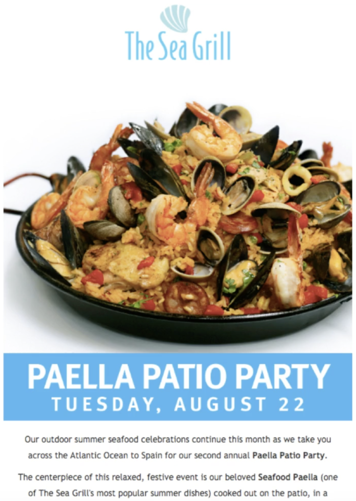
In fact, 194 out of 220 guests at the popular “Paella Patio Party” came from their email list. Impressive!

Email drove 194 out of 220 attendees at the Paella Party at The Sea Grill

Email drove 194 out of 220 attendees at the Paella Party at The Sea Grill

2. Personalize and micro-target.

According to Infosys, 86% of consumers say personalization impacts purchase decisions, but Emma’s own research found only 29% of email marketers segment all their emails.

Ouch. 

Jay revealed the best way to earn your subscribers’ time and attention is to “treat each subscriber like an audience of one.”

And how do you do that? By sending messages that resonate with their unique circumstances and needs with email targeting and segmentation.

At Patina, Rachel combines non-email behavior with email data: this is an optimal way to segment. She sends targeted promotions based on purchase data. 

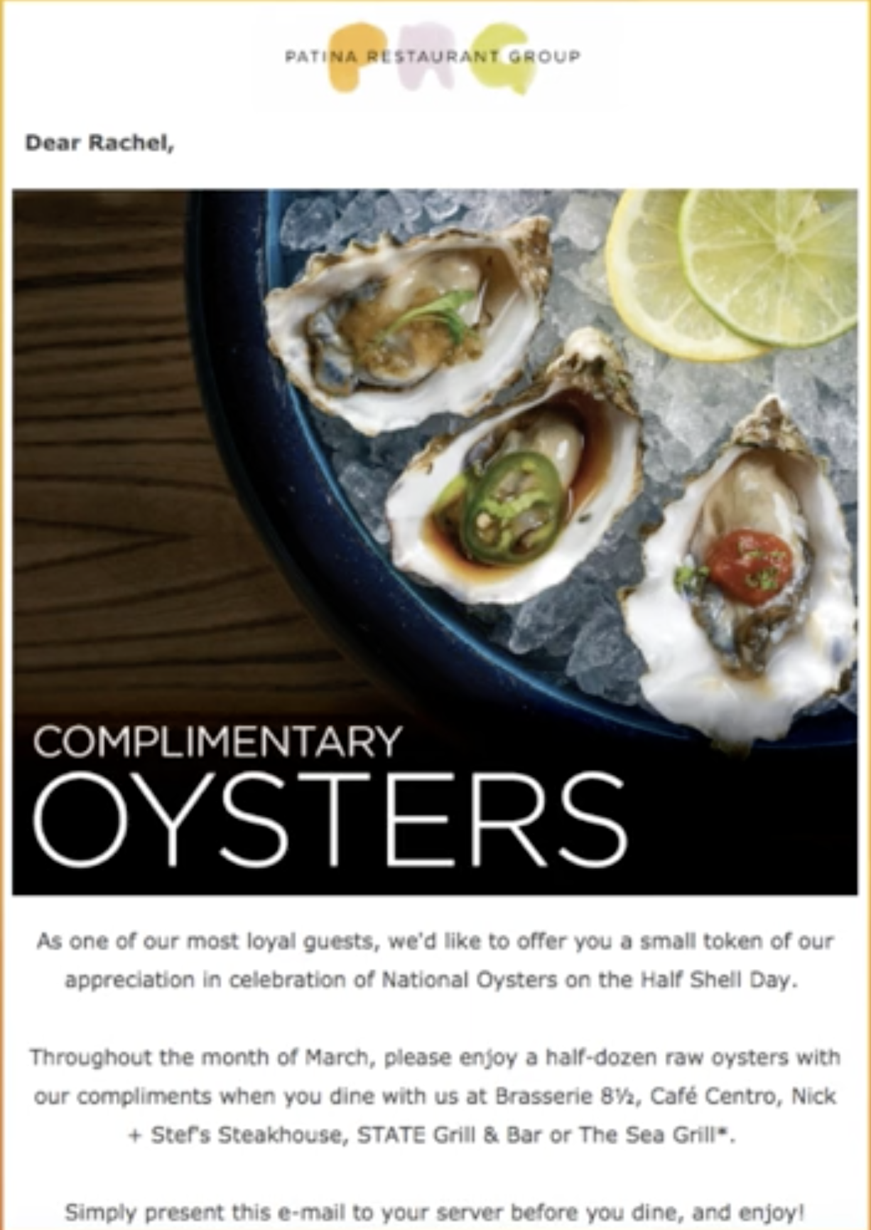
In this example, she explained how she sent a complimentary oyster offer to a list of 80 people who spent $25 or more on oysters in the last 6 months.

The results?

She achieved a 50% open rate, and 12 people came to a restaurant and redeemed the oyster offer. That’s a 15% conversion rate, from subscriber to in-store visit. Wow!

80 might seem like way too small of a group to send to, but no list is too small for results when you target and personalize.

3. Boost authenticity with personalization and user-generated content.

As Jay explained, every business is just a collection of people, and we trust people more than we trust businesses.

You can use user-generated content to find interesting, trust-worthy images and content to humanize your emails and persuade your subscribers to take action.

The more personal and trustworthy your emails are, the better your results will be.

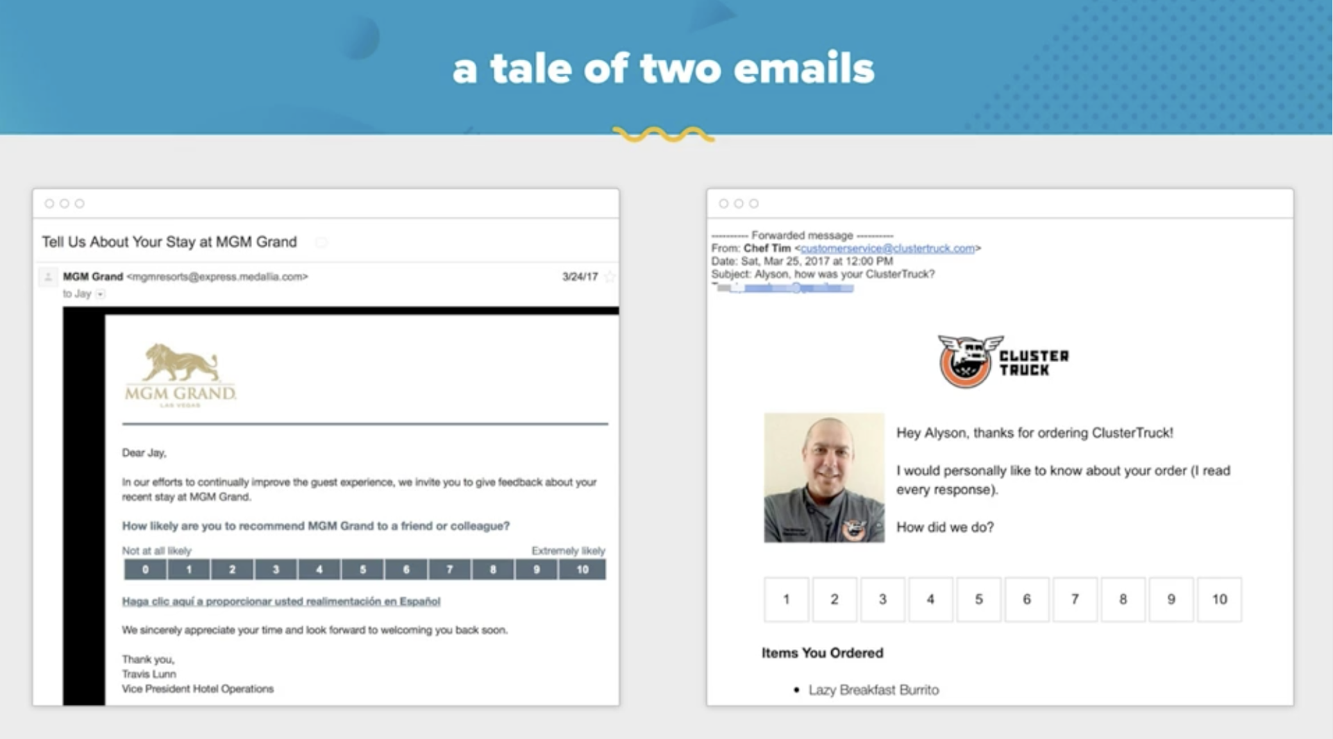
Jay shared two examples of survey emails, asking for feedback about his experience with the company. Guess which one Jay filled out?

personal survey email

Which survey would you be more likely to take?

Yup, you guessed it. Not the one on the left.

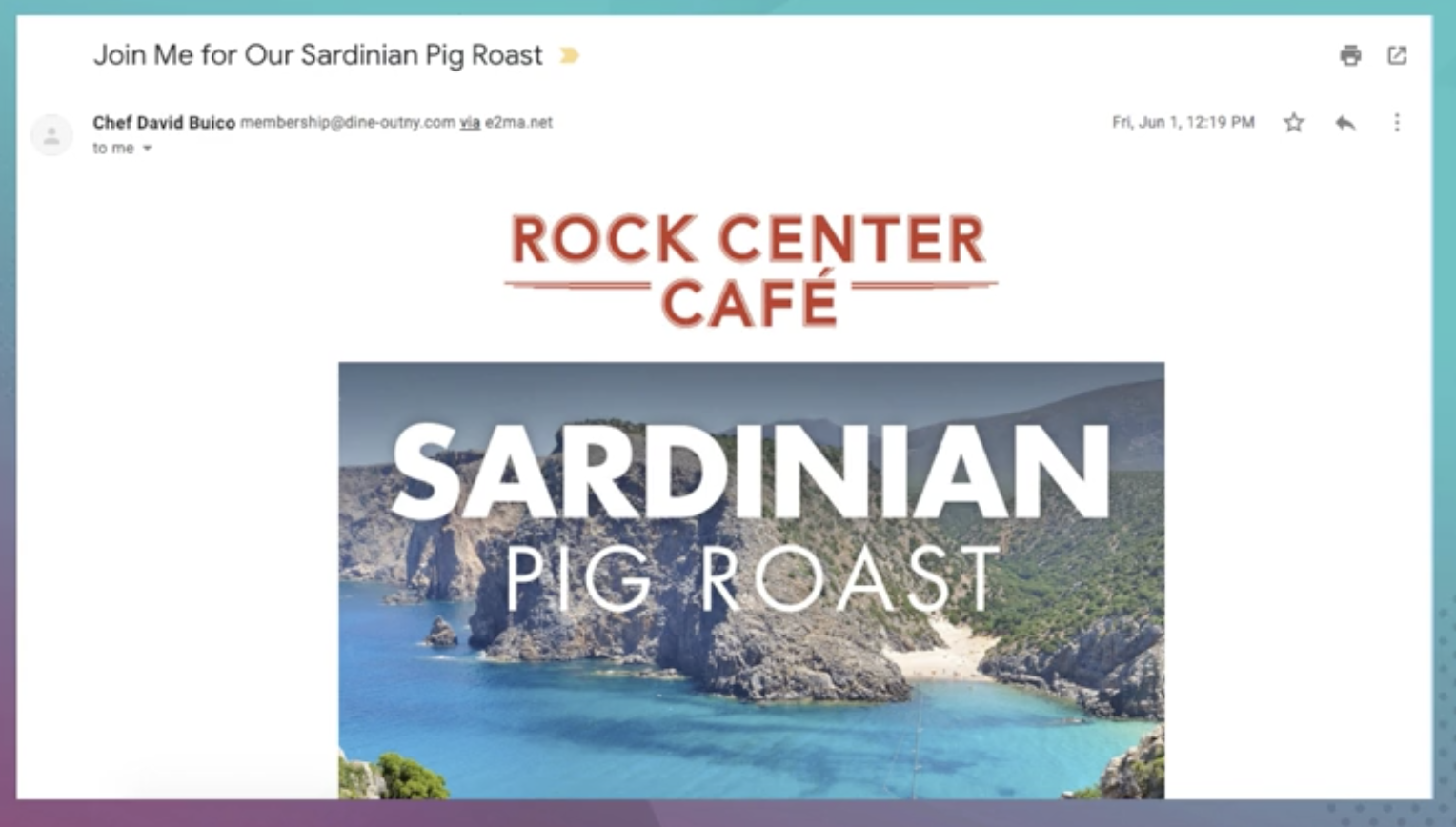
Rachel also achieves fantastic results by personalizing emails at Patina, and sometimes she even makes the from name “Chef David Buico”, executive chef at Rock Center Café and Summer Garden & Bar. Those personal emails from the chef also result in higher opens, but Rachel is careful to not overdo it and use the chef’s name all the time—only when it makes sense for the message and feels authentic, and something that the chef would actually say

personalize emails

4. Always test your emails.

Email is one of the most testable forms of marketing. If you’re sending emails, you should be testing.

But where do you begin?

Start with your hypothesis (if we change X, it will result in X), seek to prove yourself wrong (not right!), and make sure your variations are different enough to actually achieve a measurable difference in results. So don’t test a Gala Apple against a Honeycrisp. Test an apple against an orange. (This something I am constantly reminded of here at Convince & Convert! We just A/B tested our newsletter and the challenger and control achieved the same click-through rate!)

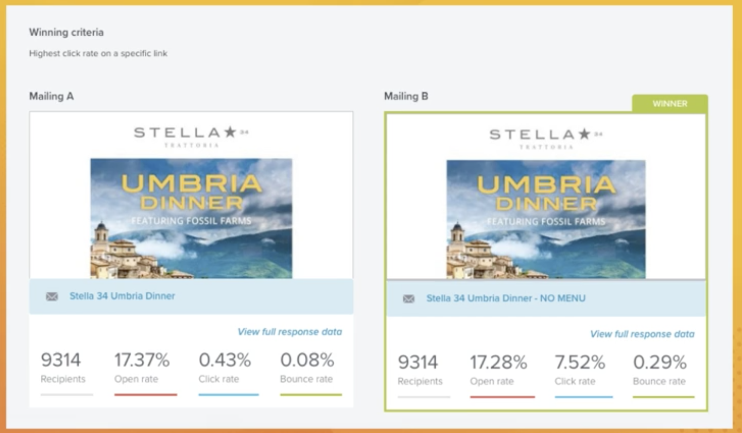
Rachel tests her emails at Patina, and she often has to re-test to achieve clear results because her list is (relatively) small. In this example below, she A/B tested an email with a menu and an email without a menu.

It’s safe to assume the email with the menu achieved a higher click-thru rate, right?

email test

Wrong!

This is precisely why we must always test our emails—we never know what will work until we actually test it.

5. Look at benchmarks, and then ignore them.

There is more email benchmark data than any other kind of marketing benchmark data.

But benchmarks will only tell you so much, and if all your care about are averages, you’ll always be an average marketer.

“Think outside the box in order to break through the inbox, and don’t be afraid to test something unusual,” says Jay.

Because really, who is satisfied with a 3.30% click-thru rate?

So if you want to truly stand out with your email marketing, watch the entire reply of 5 Ways to Make Your Email Marketing Awesome with Jay, Rachel, and our friends at Emma. It’s fast, it’s fun, and even if you’ve been in email marketing since the days of Prodigy and AOL, I promise you’ll take away actionable ideas to make your email stand out and be awesome.

12 Books About Blogging and Content Marketing You Need to Check Out

12 Books About Blogging and Content Marketing You Need to Check Out

The content marketing and the blogging worlds are closely tied together. A common trait of both is that these environments change very quickly. What works this month might not offer good results the next month and you never know when these major changes might occur, because they are caused by many factors.

I’m mentioning this because it can be difficult to find books for blogging or content marketing that can always give you something useful. In the digital world, some practices might be relevant for a certain period of time and then they are never used again. In other words, finding the right resources is so tricky. This is why I’ve decided to do some research and offer book suggestions that you can always rely on.

When it comes to content, no matter if it’s for blogging purposes or marketing, it’s essential that you find sources of inspiration and expert opinions that could shape your style and make your better at what you do.

How to Grow Your Email List With Pinterest

Do you have an engaged audience on Pinterest? Wondering how to get your Pinterest followers onto your email list? In this article, you’ll discover how to promote your email opt-in via your Pinterest profile, boards, and pins. Begin With an Email Opt-In That Provides Value to Your Ideal Audience The first step is to create

Monday, September 3, 2018

3 Facebook Ad Types That Improve Sales

Want to improve your sales using Facebook ads? Looking for different ad formats to try? In this article, you’ll discover how three Facebook ad types can help you better present your products and drive sales. #1: Capitalize on Initial Awareness With a Facebook Carousel Ad The carousel ad is one of the most effective Facebook

Internal Linking & Mobile First: Large Site Crawl Paths in 2018 & Beyond

Posted by Tom.Capper

By now, you’ve probably heard as much as you can bear about mobile first indexing. For me, there’s been one topic that’s been conspicuously missing from all this discussion, though, and that’s the impact on internal linking and previous internal linking best practices.

In the past, there have been a few popular methods for providing crawl paths for search engines — bulky main navigations, HTML sitemap-style pages that exist purely for internal linking, or blocks of links at the bottom of indexed pages. Larger sites have typically used at least two or often three of these methods. I’ll explain in this post why all of these are now looking pretty shaky, and what I suggest you do about it.

Quick refresher: WTF are “internal linking” & “mobile-first,” Tom?

Internal linking is and always has been a vital component of SEO — it’s easy to forget in all the noise about external link building that some of our most powerful tools to affect the link graph are right under our noses. If you’re looking to brush up on internal linking in general, it’s a topic that gets pretty complex pretty quickly, but there are a couple of resources I can recommend to get started:

I’ve also written in the past that links may be mattering less and less as a ranking factor for the most competitive terms, and though that may be true, they’re still the primary way you qualify for that competition.

A great example I’ve seen recently of what happens if you don’t have comprehensive internal linking is eflorist.co.uk. (Disclaimer: eFlorist is not a client or prospective client of Distilled, nor are any other sites mentioned in this post)

eFlorist has local landing pages for all sorts of locations, targeting queries like “Flower delivery in [town].” However, even though these pages are indexed, they’re not linked to internally. As a result, if you search for something like “flower delivery in London,” despite eFlorist having a page targeted at this specific query (which can be found pretty much only through use of advanced search operators), they end up ranking on page 2 with their “flowers under £30” category page:

¯\_(ツ)_/¯

If you’re looking for a reminder of what mobile-first indexing is and why it matters, these are a couple of good posts to bring you up to speed:

In short, though, Google is increasingly looking at pages as they appear on mobile for all the things it was previously using desktop pages for — namely, establishing ranking factors, the link graph, and SEO directives. You may well have already seen an alert from Google Search Console telling you your site has been moved over to primarily mobile indexing, but if not, it’s likely not far off.

Get to the point: What am I doing wrong?

If you have more than a handful of landing pages on your site, you’ve probably given some thought in the past to how Google can find them and how to make sure they get a good chunk of your site’s link equity. A rule of thumb often used by SEOs is how many clicks a landing page is from the homepage, also known as “crawl depth.”

Mobile-first indexing impacts this on two fronts:

  1. Some of your links aren’t present on mobile (as is common), so your internal linking simply won’t work in a world where Google is going primarily with the mobile-version of your page
  2. If your links are visible on mobile, they may be hideous or overwhelming to users, given the reduced on-screen real estate vs. desktop

If you don’t believe me on the first point, check out this Twitter conversation between Will Critchlow and John Mueller:

Saturday, September 1, 2018

Facebook Group Admin Tools and Updates

Welcome to this week’s edition of the Social Media Marketing Talk Show, a news show for marketers who want to stay on the leading edge of social media. On this week’s Social Media Marketing Talk Show, we explore Facebook Groups admin tools and updates. Our special guest this week is Holly Homer. Tune In to